When you play a game of footy, there’s rules you gotta follow. When you’re cooking in the kitchen, you might use a recipe to nail your dish. Similarly, with graphic design, there are a set of guidelines we consider, especially when designing logos or new branding for our Perth clients.
Why does it matter?
Stunning, eye-catching designs don’t just happen. A lot of thought and attention to detail goes into executing effective visuals – no matter where it’s applied. How these visuals come about are guided by a set of design elements and principles.
When we talk about elements we’re generally referring to the things that make up a design, which include:
- Line
- Shape
- Direction
- Size
- Texture
- Colour
The principles of design are what we do to those elements. The way we apply these determines the end result.
Graphic design principles
Our graphic design team in Perth use a bunch of principles to create great, compelling designs. Many of these principles are used interchangeably and complement one another.
If you ever request any graphic design work or have a branding project, the graphic designer is likely to follow principles similar to the ones we’re going to explore below. Applying these principles can often mean the difference between executing a good and bad design. Having been in the industry for a while, we’ve seen our fair share of bad graphic designs in Perth!
Hierarchy
When we refer to hierarchy in a visual sense we mean organising the value of the elements within a design, so that it draws attention to the most important information.
Ranking information from most important to least important makes it easier for someone to consume and understand the content. This is particularly relevant in UI design. It’s often the first principle we look at when taking on any graphic design work.

Balance
Balance provides stability and structure to a design. It’s how the elements within a design are arranged such as symmetrically or asymmetrically, to create the impression of equality in weight or importance.

Scale
The scale – how big or small an element is in comparison to another, directly influences the balance of a design. Bigger is not always necessarily better, sometimes the design can be more effective using smaller elements. It’s all about the message you’re trying to convey.

Contrast
Contrast is about emphasising or highlighting the difference of key elements in a design. The difference could be light and dark, thin and thick, big and small or bright and dull. Contrast is mostly linked to readability, legibility and accessibility.

Repetition
Repetition strengthens a design by bringing together individual elements. It’s as the word suggests – an element that is repeated throughout a design. It could be anything, such as a certain font colour, line, shape or pattern being repeated.

Pattern
It’s easy to get confused and think repetition and pattern are the same thing, as they both involve repeated elements. As mentioned, repetition occurs when the same elements are repeated throughout a design, whereas a pattern is made up of different components repeated in the same way.
Patterns can be used to create balance, make a design look consistent, or create contrast. You’ll see patterns commonly applied in backgrounds on websites and in mobile applications.

Emphasis
Emphasis is all about grabbing attention. We apply a specific element to a distinguishing feature to separate it from the rest of the design. This can be achieved through the use of other principles such as contrast, movement, scale or balance.

Movement
It’s not just what you look at, it’s how you look at it. Designers use movement by incorporating lines, edges, shapes and colours to draw the eye through the design in a certain way. This can be achieved by using repeating or alternating elements or patterns.

Space (white space)
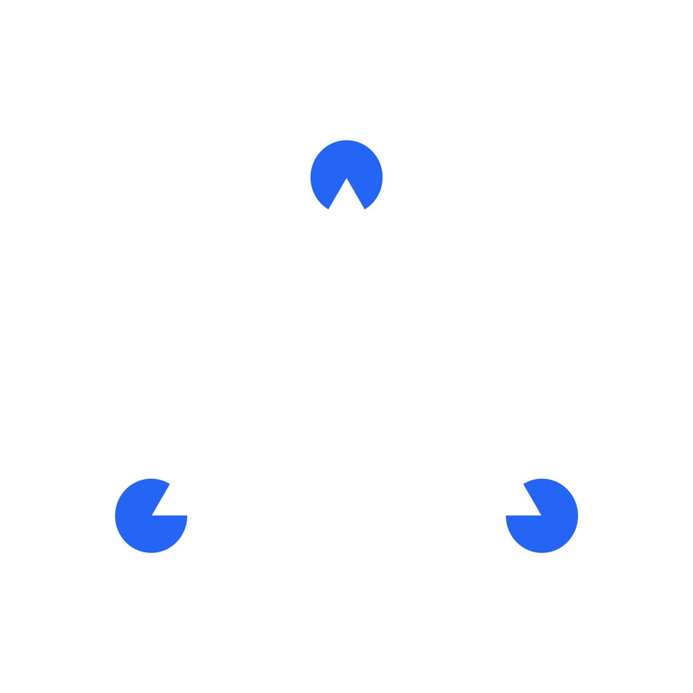
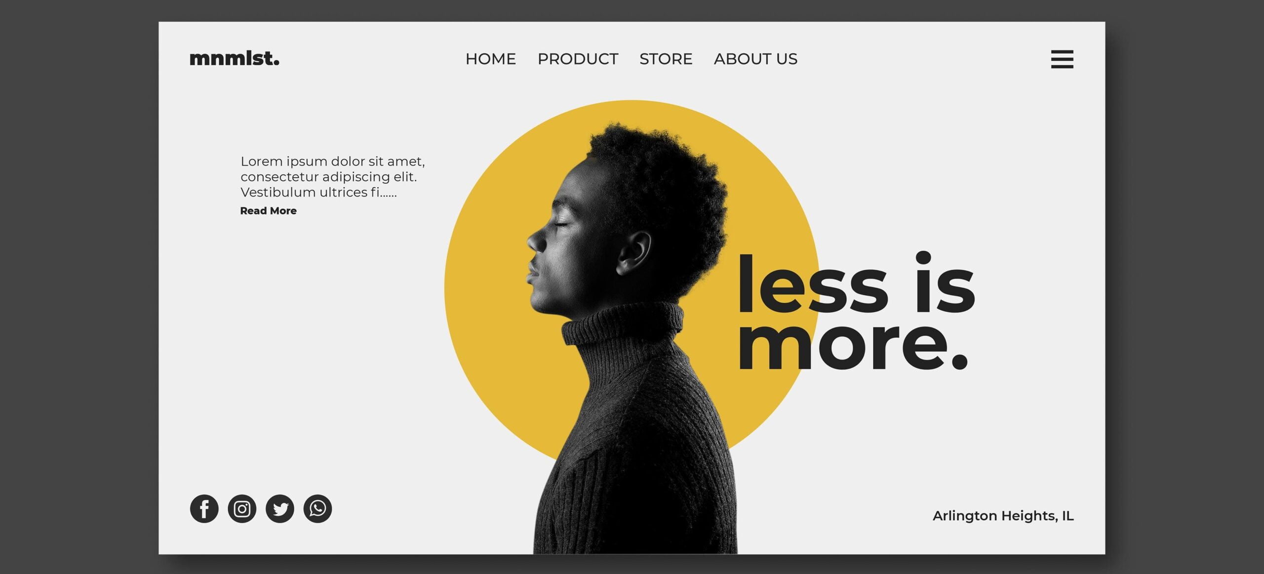
Space refers to the distance or area between, around, above, below or within elements. Often referred to as white space or negative space, it’s the part of the design that doesn’t contain anything at all. No images, drawings, shiny colours or text. Having white space applied in the right way can be just as effective over anything else in a design, so it’s an important factor to consider.

Unity
How does the final result look when you put it all together? The way the elements are all arranged should create unity, in other words completeness. There are 3 main things to look out for to achieve a visually compelling composition:
- Does each element serve its purpose?
- Do the elements work well together?
- Is the message or concept you’re trying to communicate clear?

Creating stand out graphic design and branding in Perth
We hope by understanding the tools we use to apply in design, it gives you a better understanding and appreciation of what goes into the designs we create every day.
Got a branding or design project in mind? Get in touch with our Perth graphic design team.


